
A Tribute to the photo collections of N. Lewis and D. Boxall
My bad habit is looking at pictures of beautiful streets. I can stare at them for hours in a state of total wonderment. Because they feel comfortable, safe, welcoming, alive… and nobody seems to know why.
But recently, I began to notice a pattern; the best streets all fit the same basic form with regard to width and height (width between -and height of- building facades).
The best streets are about 20 feet wide, and the enclosing buildings are between 1.5 and 2.5 stories in height. Full Stop. No ratios.
If these rules are deviated from, keep in mind:
- Streets narrow than 20 feet usually maintain the human-scale naturally; streets wider than 20 feet must have plenty of people and plenty of trees.
- Buildings above 2.5 stories don’t seem to have any adverse effects besides blocking sunlight; buildings below 1.5 stories pose a serious threat to the comfort and livability of the street.
- Never ever go below 1 story (i.e. setback or parking lot). None of these Great Streets have parking lots, empty fields, or other forms of “missing teeth”.
But we often see references to a “width:height ratio”. Let us examine some contemporary thinking and literature, and see how they went wrong.
J. Speck says:
“…the comfortable walk has to do with the fact that all animals seek, simultaneously, prospect and refuge. We want to be able to see our predators, but we also want to feel that our flanks are covered. And so we’re drawn to places that have good edges, and if you don’t supply the edges, people won’t want to be there. What’s the proper ratio of height to width? Is it one to one? Three to one? If you get beyond one to six, you’re not very comfortable anymore. You don’t feel enclosed.”
This concept of prospect and refuge is quite powerful. But where does this “one to six” come from?
“The threshold when pedestrians first perceive enclosure is a 1:4 ratio of building height to thoroughfare width—typical of low-density environments. In denser urban contexts, height-to-width ratios between 1:3 and 1:2 create an appropriate enclosure on a thoroughfare (Figure 4.2). Highly walkable thoroughfares do not require tall buildings.”
~Designing Walkable Urban Thoroughfares (henceforth DWUT)
According to DWUT, people don’t even begin to feel a sense of enclosure until the height exceeds 1/4 of the width. But is a ratio the correct metric? The illustration referenced by DWUT gives the lie to this concept (illustration source: Community, Design + Architecture):

“Human scale ratios fall between 1:3 and 1:2 as measured from the building fronts.” ~DWUT
A couple stark realities confront me when I look at these two cross-sections:
- The wider+taller cross-section doesn’t look remotely like any of the Great Streets from the Lewis and Boxall photo collections. My personal experience too includes quite a number of wonderful streets, and I don’t recall any of them looking like this.
- The narrower+shorter cross-section has two sides, and the left side looks obviously more comfortable than the right side!
- Both cross-sections are so wide that they don’t feel like a single street; the buildings on the far side of the street make no contribution to one’s sense of refuge. They actually feel like independent “half streets”:
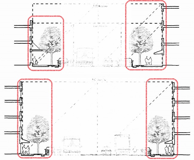
“Street trees may be used to provide a similar sense of definition and enclosure in contexts with lower height and less dense buildings.” ~DWUT
The four “half streets” are defined not by two building facades, but by one building facade and one row of trees.
Viewed, this way, we can easily see that all four sections have basically the same width. Their width is the same not in the sense of a ratio, but in an absolute sense. It is about 15-20 feet.

Interesting! My thoughts about wide streets are the same as yours, based on the changes to Gaien Higashi Dori, which is being widened outside our flat. A narrower street is easier to cross, and the opposite side is an attraction. But a wide street is an obstacle. So you lose the other side of the street…this is what is going for us now.
LikeLiked by 1 person
Boulevards often have street furniture and trees and even newsstands or other vendors in the center of a road. A nice 3-8m walkway with trees on either side makes a nice mid-street experience. Then there will be car lanes (ideally only one or two) on either side and another sidewalk by the buildings.
It works better if the buildings are two or more stories and have some architectural interest (and zero gaps) from a distance.
LikeLike
This sounds like a description of La Rambla in Barcelona? Interestingly, I don’t think La Rambla has ever appeared in either the Boxall or Lewis collections.
LikeLike
The first street I thought of was Álvaro Obregón in Mexico City, locally famous and the street I used to live on myself for two years. It’s often occupied by the book festival, art walks, or street fairs. But La Rambla is a world classic.
https://goo.gl/maps/ZiSbgqeb8mt
Lots of cities have them and they seem like an underappreciated amenity to me.
LikeLiked by 1 person
Miami may get something similar to Álvaro Obregón: http://www.moderncities.com/article/2017-feb-miamis-giant-pop-up-recreates-downtown-street-/page/1
LikeLike
Some related literature:
Note the sections on “transparency” (i.e. depth) and complexity:
http://urbanland.uli.org/infrastructure-transit/eight-qualities-of-pedestrian-and-transit-oriented-design/
Great summary of Jan Gehl thinking:
http://flatironbike.com/2012/10/19/making-boulder-into-one-of-jan-gehls-cities-for-people/
LikeLike
Yeah, I definitely think that the typical American Main Street (50-90ft) is not a good width for creating a sense of enclosure and much too wide. Fortunately, most of them do have street trees, flower beds, restaurant patios, street furniture and on-street parking to provide an edge on the sidewalk. This leads to a 10-20 ft wide pseudo-enclosed space. I actually think the on-street parking is more important than the street trees, since the tree canopies are usually above our natural gaze, and the tree trucks themselves are only 5-10 inches thick and separated by 15ft+. Parked cars are sufficiently solid, tall and heavy to protect us from errant drivers.
I don’t get a particularly strong feeling of enclosure from Yonge Street in Toronto.
https://www.google.com/maps/@43.6641033,-79.3842568,3a,75y,343.83h,94.76t/data=!3m6!1e1!3m4!1s2Ftg7PtOMEqpLmkigF-m6w!2e0!7i16384!8i8192
Whereas with the main street of Niagara On The Lake, which is famous for sparing no expense on landscaping and street furniture, I do get a decent feeling of enclosure even though the buildings are a bit shorter and the road is wider compared to Yonge.
https://www.google.com/maps/@43.2561811,-79.0739039,3a,75y,93.04h,91.89t/data=!3m8!1e1!3m6!1sAF1QipOtW-TzPBOlfCreklTmWkfeG5GeZJ-QAt4WuO4c!2e10!3e11!6shttps:%2F%2Flh5.googleusercontent.com%2Fp%2FAF1QipOtW-TzPBOlfCreklTmWkfeG5GeZJ-QAt4WuO4c%3Dw203-h100-k-no-pi0-ya347.718-ro-0-fo100!7i5376!8i2688
LikeLike
I’d read Speck a few years ago and liked him; very interesting to get this different perspective on ideal street width. Definitely feels like there’s something to it: 50 feet street and buildings is not the same as 20.
I also liked a bunch of your other posts: street hierarchy, SLOW streets, Nagoya corners, and others.
Hope you’re okay!
LikeLike