The most frequently cited measure of prosperity – GDP per capita – has a fatal flaw: it simply doesn’t align with our common sense perceptions. According to GDP per capita, utterly lifeless American suburbs are richer than the densely built and lively streets of urban Portugal.
Fundamentally, the problem lies with the “per capita” part; we intuitively associate a beautiful house inhabited by many people with wealth, while a plain house – or multiple plain houses – inhabited by one person looks like poverty. It’s basic common sense that a street with a hundred shops is richer than a street with just a few – regardless of the number of people living on the street.
When we talk about a neighborhood thriving, when we talk about a main street (or high street or shotengai) being prosperous, when we talk about a building being glamorous, we aren’t thinking of income per capita; we are thinking of wealth per square mile (or sqkm).
Stated simply:
Prosperity is area density of wealth
Above: Hartford, Connecticut. Below: Lisbon.
Reject any metric that calculates Hartford to be richer than Lisbon.
Prosperity is wealth divided by area
But how to define wealth?
One approach would be to use the current market value. This has only two major flaws:
1) While recent & estimated market values of houses are easy to find, market values of roads, walkways, drainage infrastructure, and rail lines may be difficult to estimate.
2) Market value of houses is very sensitive to supply and demand, which is very sensitive not only to demographic trends, but also to macro-economic phenomena such as “Dutch Disease”. In short, the presence of extractive industries will inflate market value beyond our common sense perception of “wealth”.
For the purpose of making actual measurements, and actual comparisons, we want to use some simple substitute.
Stated scientifically:
Prosperity is area density of Amenity X
[In the examples below, we will use grocery stores. In some cases we add in coffee shop and restaurant density for more accuracy, but this takes longer]
On the one hand, this doesn’t line up exactly with our common sense perception of wealth, in so far as it devalues residentially & industrially zoned areas. On the other hand, this lines up even better with our understanding of good urbanism and walkability.
Corollary:
Street Life is the only measure of prosperity; factories and offices may contribute to prosperity, but do not represent prosperity per se; shelter is a physiological necessity, but does not represent prosperity per se (if we distinguish between social wealth and private wealth, housing falls into the category of private wealth, while social wealth is more meaningful for most purposes).
The following examples show that this simple metric (amenities per unit area) portrays the observable wealth of various cities more accurately than GDP per capita. Following screencaps all from WalkScore.com:
Example 1 – Hartford:

Hartford, Connecticut:
9 groceries within 0.6 mile (1 km) radius (2.93 sqkm area) = 3.1 groceries / sqkm
GDP per capita: $76,510 ~ (2015 report on 2013 data, by Brookings Institution)
Example 2 – Lisbon:
Lisbon:
22 groceries within 0.3 km radius (0.283 sqkm area) = 78 groceries / sqkm
GDP per capita: $26,962 for the metro area of 2.8 million people (2016 stats from Eurostat via Knoema, at today’s exchange rate)
Visit both cities, or spend some time on Google StreetView, and you will agree that Lisbon is roughly 25 times more prosperous than Hartford.
Example 3 – Minneapolis:

12 groceries within 0.5 mile radius (2.03 sqkm area) = 5.9 groceries / sqkm
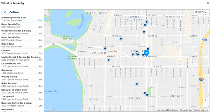
5 coffee within 0.1 mile radius
Example 4 – Downtown Berkeley:
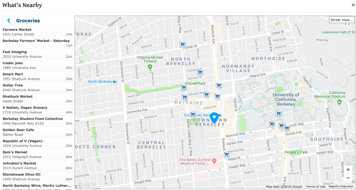
11 groceries within 0.5 mile radius (2.03 sqkm area) = 5.4 groceries / sqkm

12 coffee within a 0.1 mile radius
Uptown Minneapolis is obviously not as prosperous as Downtown Berkeley, which is why I say counting coffee shops is more accurate (they display roughly equal groceries density, but Berkeley’s coffee density is more than twice as high).
Example 5 – San Francisco:

14 coffee within a 0.1 mile radius = 172 coffee / sqkm
San Francisco:
42 groceries within 0.5 mile radius (2.03 sqkm area) = 21 groceries / sqkm
Per capita personal income: $84,675 (2016 data, bea.gov)
Example 6 – Lower Manhattan:
Lower Manhattan:
66 groceries within 0.4 mile radius (1.30 sqkm area) = 51 groceries / sqkm
Example 7 – Detroit:

11 groceries within 1.7 mile radius (23.5 sqkm area) = 0.47 groceries / sqkm
Example 8 – Chicago (outside the Loop):

13 coffee within 0.4 miles radius (1.30 sqkm area) = 10 coffee / sqkm

9 groceries within 0.2 mile radius (0.325 sqkm area) = 28 groceries / sqkm
Example 9 – Chicago Loop:

13 coffee within 0.1 mile radius = 160 coffee / sqkm (very similar coffee density to SF)

7 groceries within 0.3 mile radius (0.732 sqkm area) = 9.6 groceries / sqkm
Notes
For comparing well mapped urban cores (US, Japan, Western Europe), the best measure is coffee+restaurants+groceries within a 0.09 km (0.06 mile) radius. In less urbanized area, a larger radius may be required to capture a reasonable number of amenities.
“Bars” is a complicated category that tests our perceptions of wealth and good urbanism; ground floor bars open to the street are good for street life; ground floor bars closed to the street (low transparency) are horrible for street life; basement and lower floor bars don’t really have much effect.
Bars in the US often have low transparency, and in addition to making no contribution to street life, such bars often do not contribute to the perception of prosperity.
Bars in Japan are usually not at street level, so there is an argument for not counting them. On the other hand, the ones at street level often have very high transparency.
Bars in Europe often are at street level, with average transparency, so there is a good argument for counting them.
For the sake of consistency, unless first hand information (StreetView and walk through videos) is painstakingly analysed, its best to just skip “bars” for all countries.
The best substitute for wealth/sqkm is probably “total # shoppes / sqkm). Using second hand information sources like WalkScore, this takes longer than counting a single type of amenity, but if we use first hand information (StreetView or flaneuring videos), it is actually easier, because we don’t have to determine the classification of each storefront.
